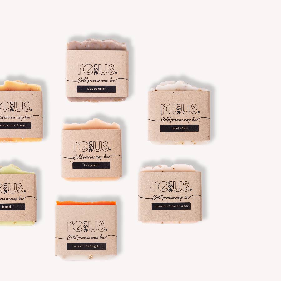
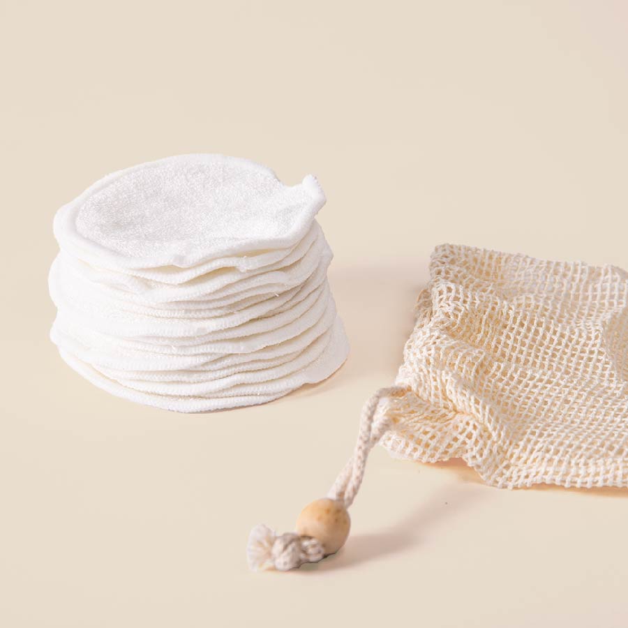
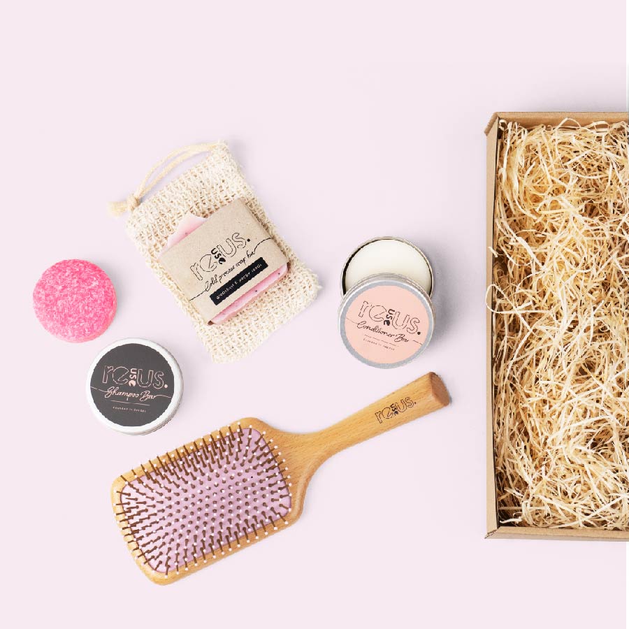
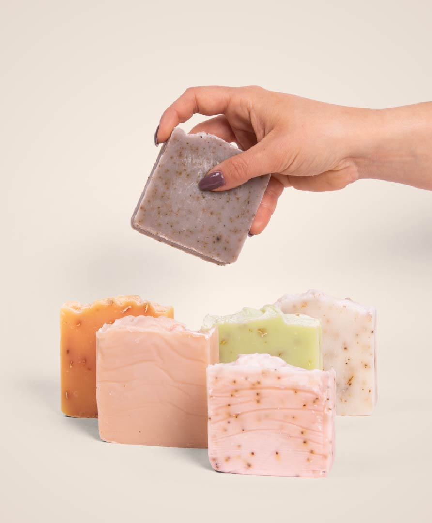
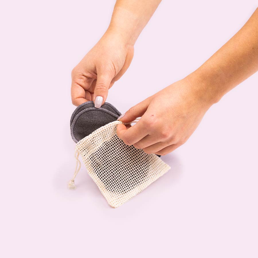
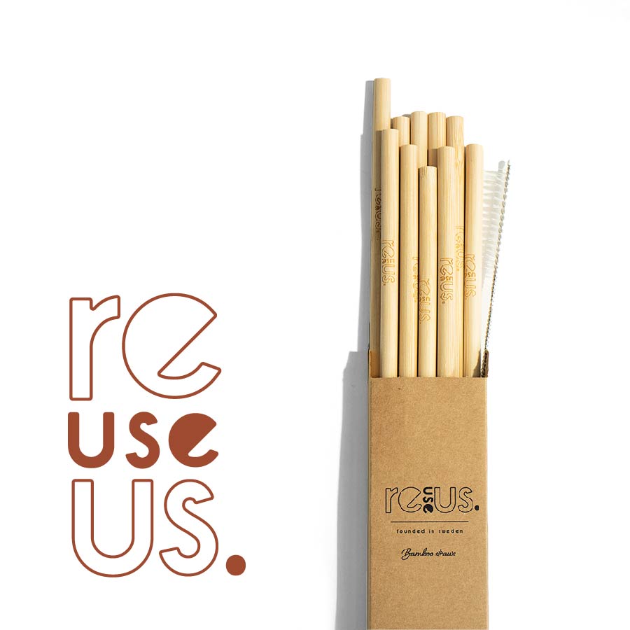
ReuseUs is a nature-inspired brand focused on sustainability, offering reusable items and eco-friendly products like solid shampoos and soaps. The brand’s visual identity is characterised by bright colours paired with natural elements like reusable paper and brown kraft paper, reflecting its commitment to the environment.
The brand identity visualises the brand’s selling points. The design process involved using bright, uplifting colours to bring energy to the brand, while incorporating natural textures and materials like reusable and brown kraft paper to reinforce the sustainability message.
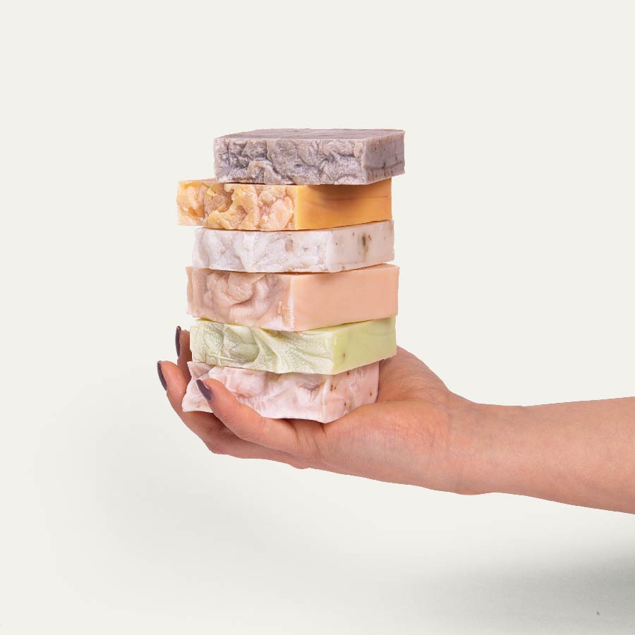
In addition to the visual branding, I supported ReuseUs with content creation, producing both still photography and engaging videos that highlight the brand’s products and their eco-friendly benefits. This comprehensive approach ensures that ReuseUs stands out in the market as a brand that is both visually appealing and committed to reducing environmental impact.
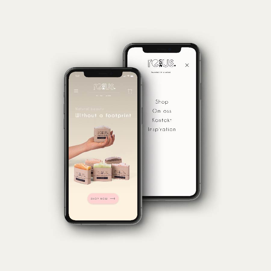
ReuseUs is a prime example of how thoughtful design can elevate a brand’s message. The bright colours and natural elements create a memorable visual identity that resonates with environmentally conscious consumers. This project highlights the power of design in communicating a brand’s values and making a meaningful impact in a crowded market.